Download Lech Sans Font Family From Ingo

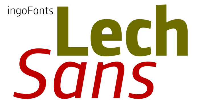
A modern sans serif — large x-height, lively forms
The typeface family of Lech Sans came into being thanks to an assignment to design a customer magazine for a company. The corporate design of the company had the intention of having its own font, but the font didn't exist. The font was to be businesslike-modern but at the same time present the effect of liveliness and movement. So I made one…
The shapes of the individual characters follow the ”humanistic“ form language of modern faces. In this way, Lech Sans offers an attractive alternative to most of the sans serif fonts used today.
The proportions have been selected to be very legible even as body type for longer texts. The font is so robust in detail that a title in large capitals is very eye-catching. It can function positively as well as negatively and is also still legible from a great distance.
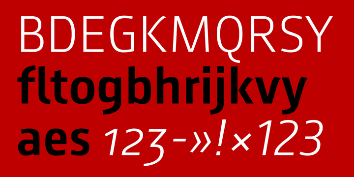
Along with ligatures for the letter combinations fi, ff, fl and tz the font also includes stylistic alternates for the German ”sharp s“ ß and the figure 3.
Additionally, Lech Sans offers three sets of figures: proportional standard figures of equal height, proportional medieval figures with ascenders and descenders and disproportional tabular figures.

